15 awful toilet designs in bars and schools
Internet / / December 28, 2020
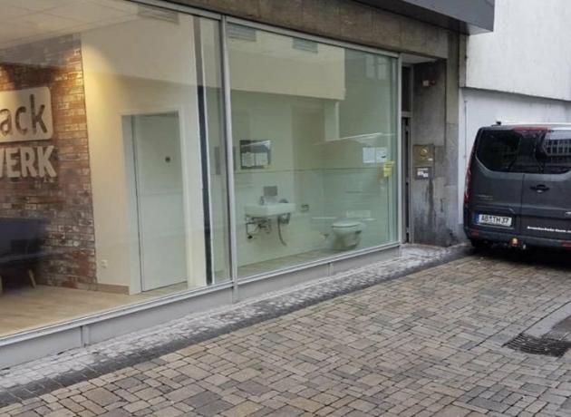
Sometimes in bars, schools and various shopping centers there are toilets that seem to be created for show. Nobody wanted or tried to make them usable. Here are 15 striking examples from netizens.
1. Transparent doors in booths are becoming more common.
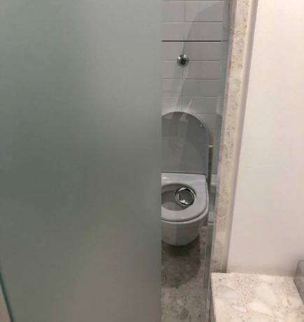
2. The relief does not change the essence.
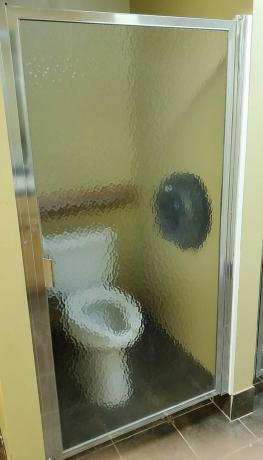
3. Or are cabins not needed at all?
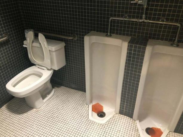
4. Another option in one of the bars.
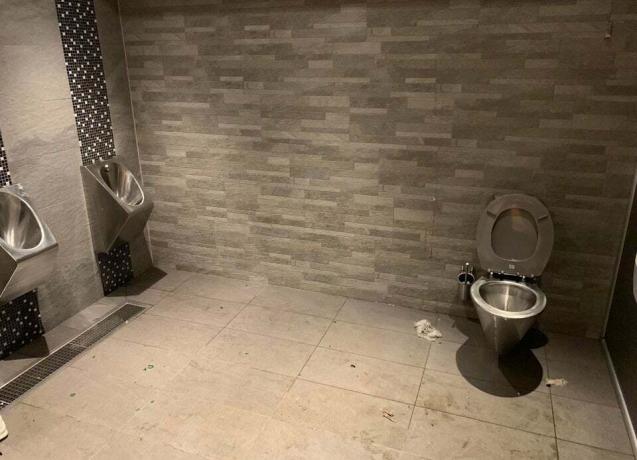
5. These booths are definitely not needed.

6. But it is light.
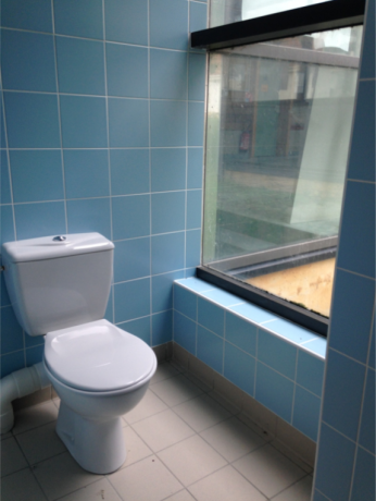
7. Or so.
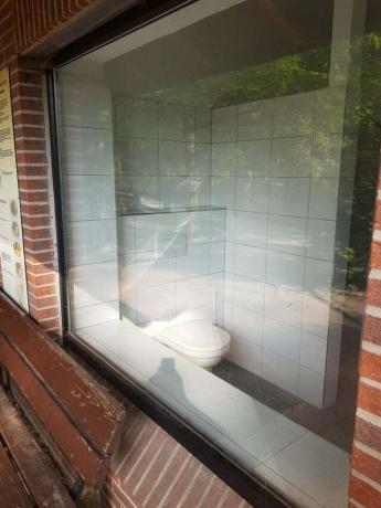
8. And just a masterpiece.
Read also🧐
- 15 examples of terrible renovation and interior design
9. Bugs? Is that you?
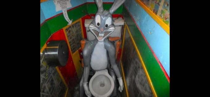
10. Another viewer option with a flush button on the chest. It's scary to imagine what is hidden behind the cover.
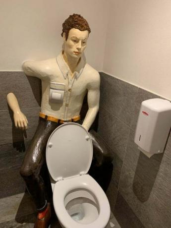
11. In crowded but not mad.
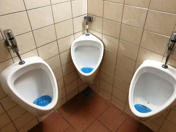
12. Almost like the famous meme. Light version.
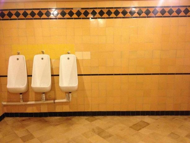
13. Mission impossible in one of the schools: get out of the stall without hitting the urinal standing at the urinal.
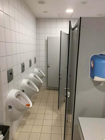
14. A toilet for wheelchair users, which they are unlikely to be able to use.
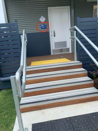
15. And how is that? Didn't know how it works, but decided to hang it?
Frames: ArtisticPurpose / Reddit
Read also🧐
- 12 photos of horrible engineering solutions in residential buildings
- Scary, funny and inexplicable: 30 examples of bad toilet design
- 15 examples of badly thought out bathroom designs


