0
Views
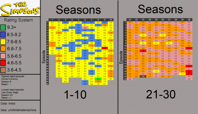
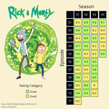
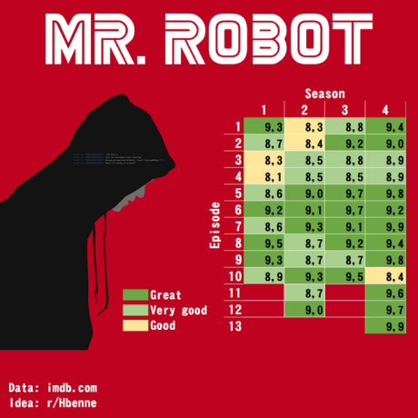
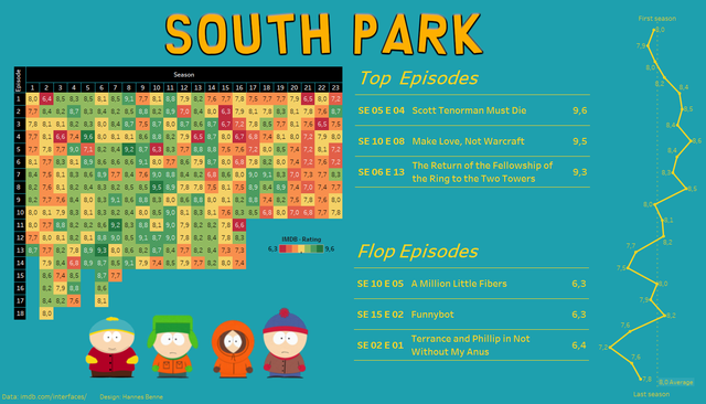
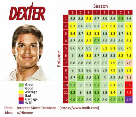
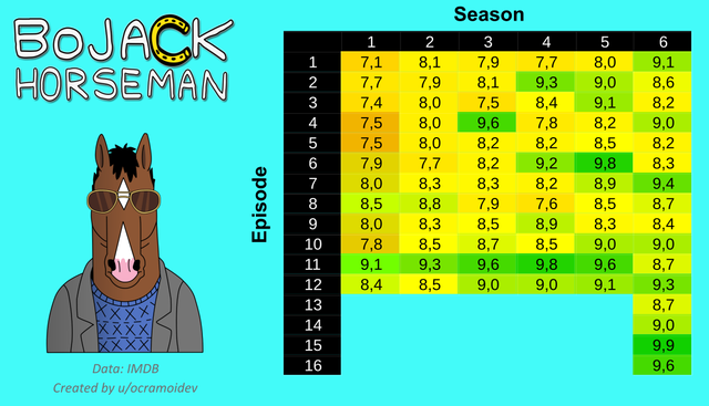
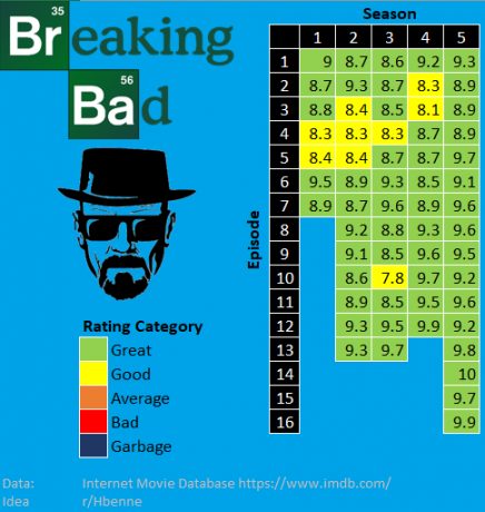
In subreddit Data is beautiful (“Statistics are beautiful”) launched a new trend. Users study the ratings of various episodes of popular TV series and cartoons and draw up a "heat map" based on them, which shows how the audience's love has changed over the seasons. In the case of completed projects, the graphics clearly show how the audience perceived the ending (you need to pay attention to the last three episodes). We have collected a few examples.


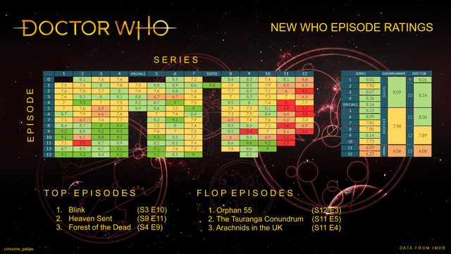
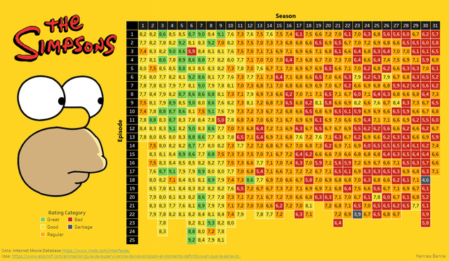
And a slightly more visual comparison of the rating of the first and last seasons:
