During the presentation macOS Big Sur great attention was paid to the security of the system and new elements that make the management of the system more convenient. But what about visual changes? Developer Andrew Denty published large-scale visual comparison of the new Big Sur and the current Catalina. Here is the main point.
Important: In all images in this text, screenshots from macOS Catalina are on the left or top, and from Big Sur are on the right or bottom.
Icons

The first to catch the eye are bright and more voluminous icons of standard applications. Key points were made larger, and the shape was brought to a uniform look. Denti suggested that in this way Apple could prepare the interface for touch displays. In the dock, apps now look smoother and very iOS-like.

Finder

The interface has become cleaner, and the default program window size is larger. There are also icons for other pre-installed applications.
System settings

Interestingly, the settings do not have the same uniformity in the icons as in the system applications. Denti notes that it is too early to judge the icons in general, because this is obviously not the final version: the notification icon does not even support Retina displays.
Battery

The "Battery" section in the settings received a lot of criticism on the Web. While it has become more useful and structured in and of itself, users really did not like the charge display icon. Let's repeat: this may not be the final version, but it looks really strange and alien in the context of the macOS interface.
Dialog boxes

Dialog boxes in the new system have changed shape, become more iOS-like and stand out more against a darker background.
Menu bar

The changes here are mostly cosmetic, but noticeable: the offsuit icons in Catalina have become much more unified in Big Sur.
Control center

The system element, borrowed from iOS, appeared only in Big Sur, so there is no comparison with Catalina here. Above you can see how it looks with light and dark themes.
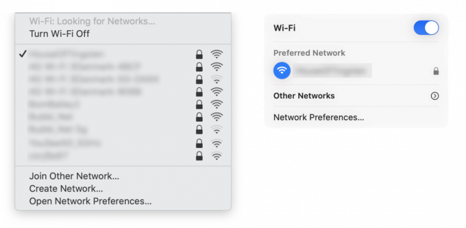
Wi-Fi panel

And again, noticeable improvements: now saved networks will be displayed as priority ones, and all the rest will hide in the "Others" section - so you don't get lost trying to find your own in a long list Wi-Fi.
Safari

The browser was adapted to the general style of the operating system.
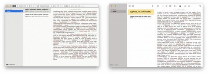
Notes

Biggest change: no more paper texture!
Otherwise, the visual changes are minimal - you can find more screenshots in blog Andrew.
Read also🧐
- Apple has released the first public beta of iOS 14. Here's how to install it
- Apple unveils macOS Big Sur with new design and redesigned apps
- Wallpapers from iOS 14 and macOS Big Sur are already available for download


