30 Examples of bad design in restaurants and bars
News / / December 19, 2019
Interior design - one of the most important components of any successful restaurant and bar. bold decisions in the design may allow an institution to stand out among the many competitors. However, an opposite result. Here are 30 examples of very bad ideas in catering, which is unlikely to attract customers.
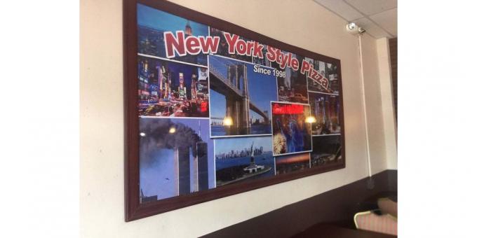
1. Pizzeria in New York City. The author thought collage, not quite clear.
2. this dish is probably intended to vegetables and fruitsBut not for the salad (with more and cleavage).

3. The picture in the restaurant, which can easily beat off appetite.

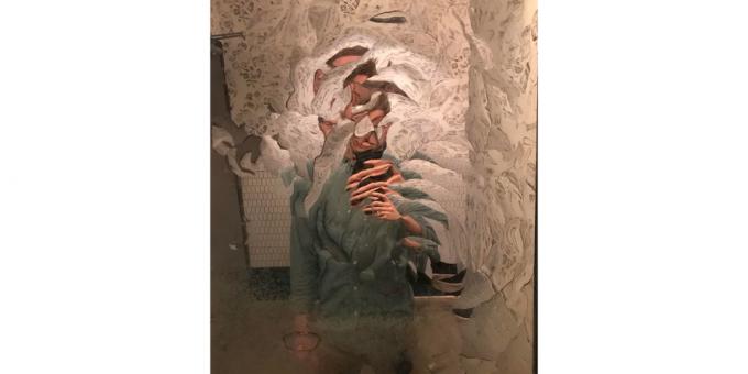
4. Mirror in a trendy establishment.
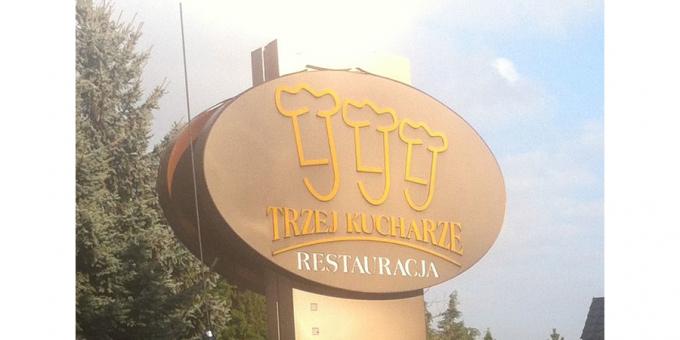
5. Three chefs on the logo of the restaurant in Poland.
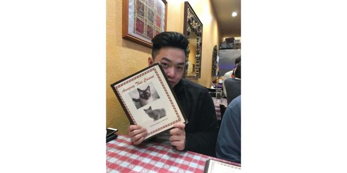
6. Menu Thai restaurant leads to some thoughts.
7. Too bold. Imagine how it worked as a waiter.

8. Somewhere in Germany. In crowded but not mad?

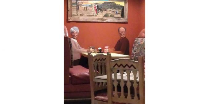
9. Drawn customers in one of Texas restaurants.
10. Another very creative mirror in the restaurant toilet.

11. Yes, this sewer, which runs right through the premises catering.

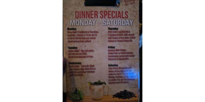
12. The photo does not blur - blurred the menu itself.
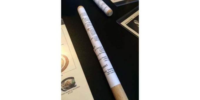
13. And in this restaurant menu is wrapped around a wooden stick. There is no other.
14. toilet design in one of the upscale restaurants of London.
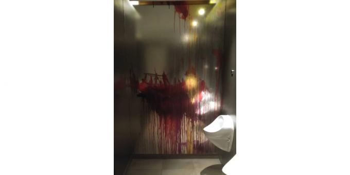
15. Again, Germany and the warmth of companionship.
16. Translucent frosted glass in the bathroom - is not so bad, but still unpleasant.

17. Advertising is never too much?

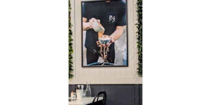
18. It is worth considering before you book here coffee.
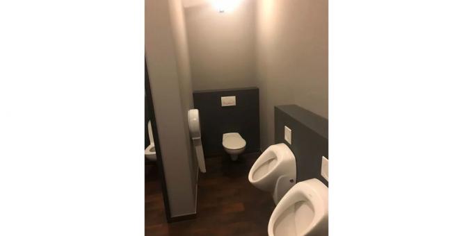
19. Let's put a urinal next to the door, it's a great idea!

20. It looks terrible.

21. In one of the Italian restaurants. It does not inspire confidence.

22. Unusually, impractical and inconvenient.

23. You can only wash one hand, because the second you need to activate a proximity sensor that is located behind the sink.

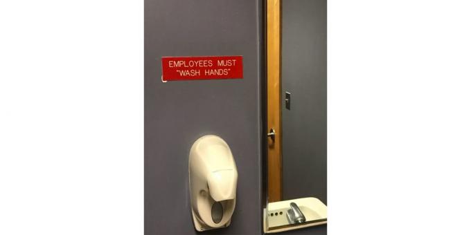
24. Reminder on a plate in a restaurant: Employees have to "wash their hands". Quotes here definitely alarming.
25. To put it mildly, not the best creative.

26. Floor tiles on the tables in the restaurant. As expected, with stitches that are impossible to wash off.

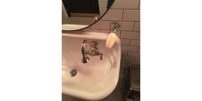
27. This soap, and use it does not want.
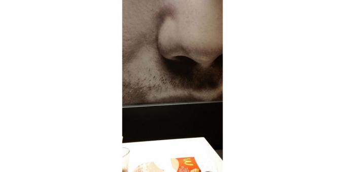
28. Someone's nose close-up on the wall in one of the restaurants McDonald's. Enjoy your meal!
29. Perhaps better to suffer.
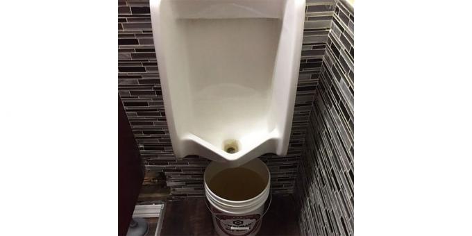
30. Thank you is not so desirable.
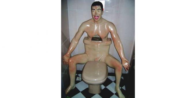
More photos - in collection Boredpanda.
see also🧐
- "You will not pass!" 30 terrible stairs that did not for people
- Nightmare realtor: 25 examples of terrible interior solutions
- "On paper, it looked better": 15 examples are not very good design
- Hell's Kitchen: 20 examples of terrible design and uninformed decisions


