When the designer mocked: 16 photos from netizens
Miscellaneous / / May 18, 2022
"Trust me, I'm a pro!" they said.
There was no time to look for a good designer with experience, so what happened was what happened. These words can describe a new selection of photos from Reddit users, who often share frames with funny signs, ill-conceived advertising, or very strange buildings.
1. Here, for example, fuel level indicators in the car. Love fractions?
2. Alex? Is that you?
3. There seems to be something wrong here too.
4. And turn off, apparently, only with a stick?
5. Just replaced the wrong letter with a ball?
6. No comments. All the same, it's clear.
7. Almost $1,000 leather bag design. Is mold in vogue?
8. When you really wanted columns, but there was nowhere to attach them.
9. Another columnist.
10. What do you know about comfort?
11. Perhaps this is not the best place for a photo of a child, and even with the caption "Alex's meat."
12. Original, of course, but not thought out at all. Hence the footprints on the floor.
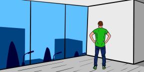
13. The “brilliant” idea is to cover the ocean view with painted glass panels when you could leave them transparent.
14. Looks like someone is being scammed here.
15. The outlines of the Apennine Peninsula and Sicily are clearly superfluous here.
16. As a child, we were taught to always wash our hands, but sometimes you really want to make an exception.
Similar selections🧐
- 10 photos of inexplicable and simply terrible design decisions
- 15 Terrible Designs That Could Get You Fired
- Terrible design that raises questions: 20 photos from the web


