10 examples of unusual packaging that can surprise
News Inspiration / / January 02, 2021
With the development of design, packaging ceases to be exclusively utilitarian - it is already part of the brand image. And some companies are willing to invest in design to make their products memorable. Collected 10 examples of this attention to detail.
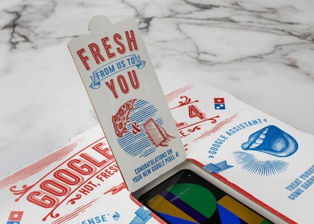
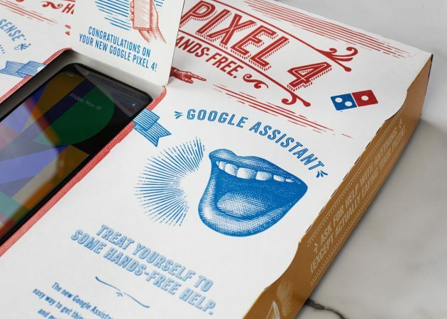
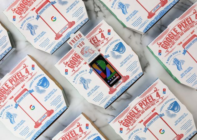
1. Let's start with a fairly well-known example. In 2019, Google decided to move away from boring faceless boxes for its equipment and sent bloggers for review Pixel 4 packaged, formalized under a box with Domino's pizza. The design is appropriate: we are promised a "top-end filling" and talk about some of the functions.
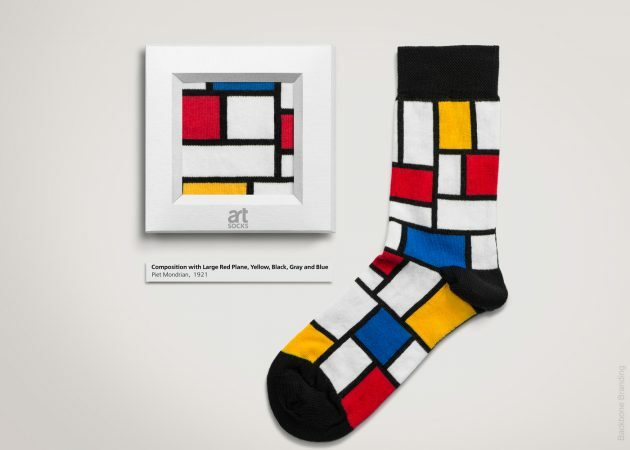
2. The designers of Hellotex sock packaging, inspired by the canvases of famous artists, made sure that the packaging worked for the overall concept. So, instead of boring cardboard, socks were placed in a frame. Getting such socks as a gift is much nicer than a regular pair. But most likely, not everyone wants to use them for their intended purpose.
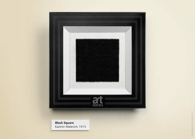
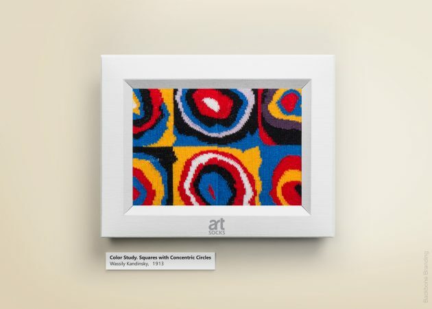
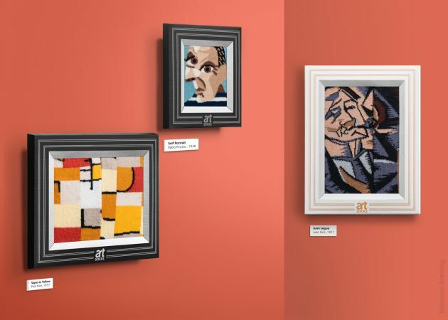
3. Another work of the same designers, but for the Color Eat project. These are sets of natural
jams, designed for a palette for paints. First of all, such packaging is designed for children: the creators wanted to turn the usual part of breakfast into a fun game. And she also beckons to mix tastes: what is not a reason to experiment and add variety to the usual recipes?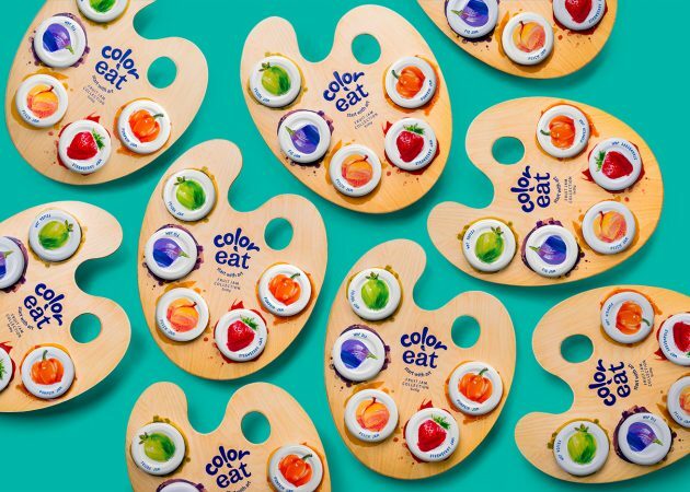
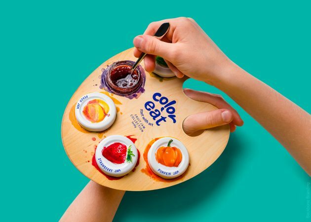
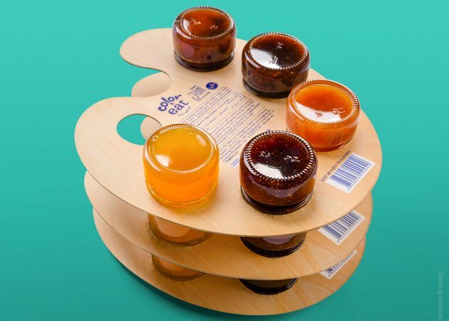
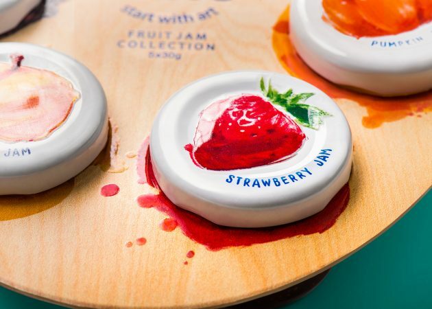
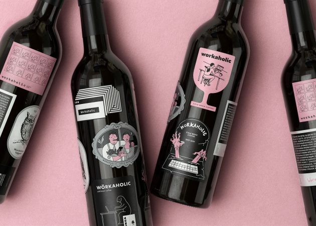
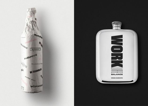
4. Concept packaging for coffee "Workaholic" from the Moscow creative agency The Clients. From the project description:
And now it seems to us that everything needs to be redone.
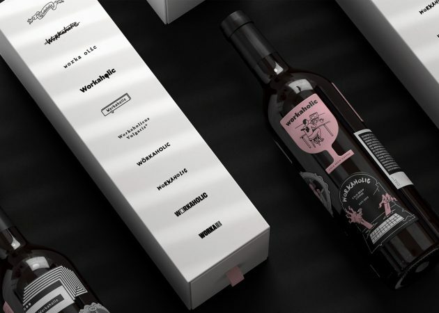
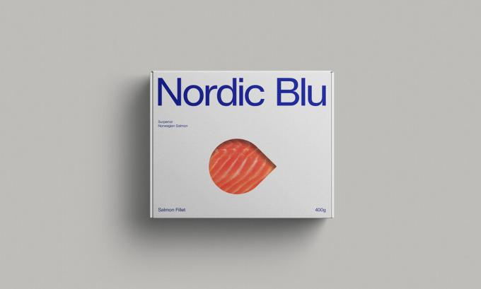
5. From redundancy to simplicity: this is how it looks packaging famous Norwegian salmon Nordic Blu. Sometimes it's worth letting the product sell itself.
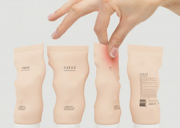
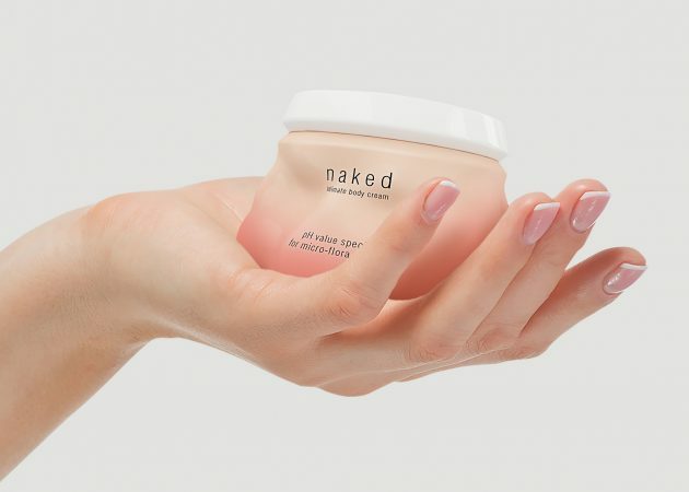
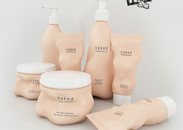
6. Packaging of Naked intimate hygiene products in color and unusual complex shape resembles the skin on the human body. It even turns red when touched due to the special thermochromic paint.

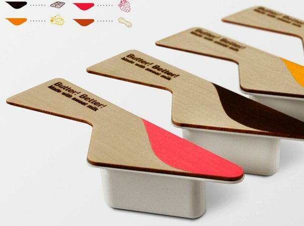
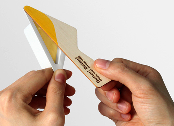
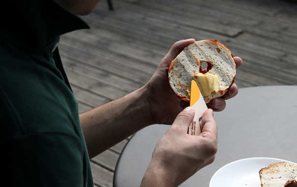
7. Portioned butter Butter! Better! uses instead of a lid, a small wooden knife - because such butter is most often taken for picnics or a quick snack, and few people carry cutlery with them.
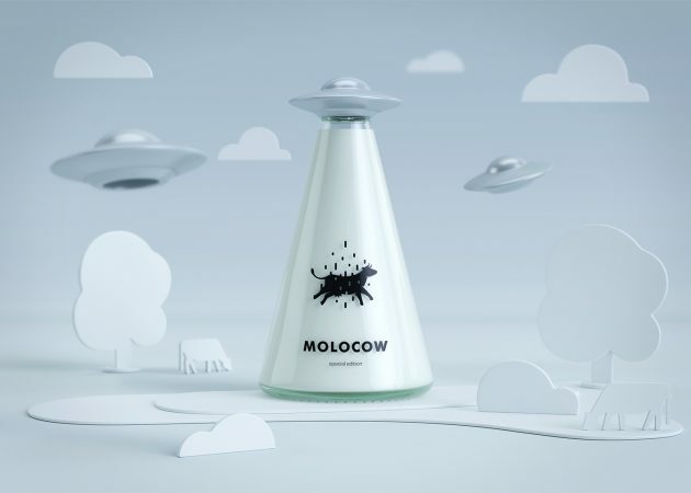
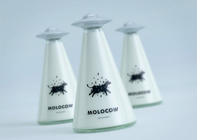
8. Packaging milk Molocow is out of this world in every sense.

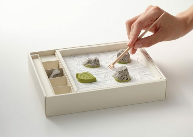
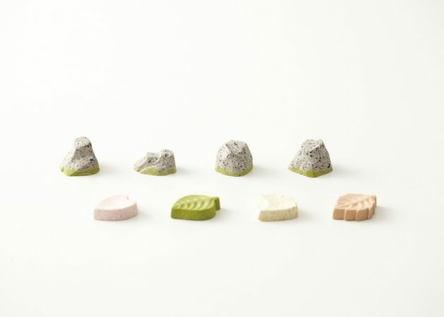
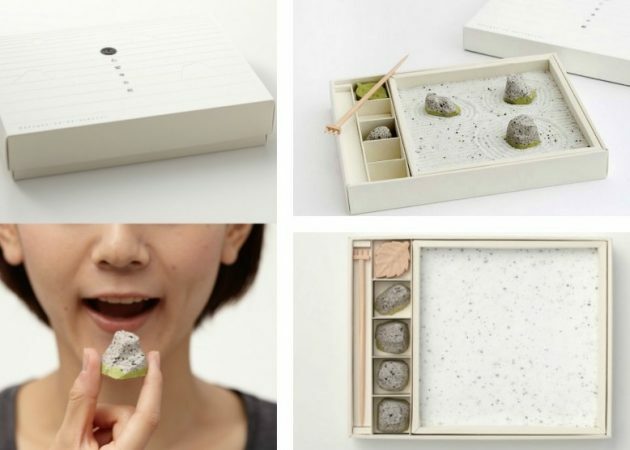
9. A story where the product and the packaging are intertwined: sweet rock-shaped sweets on granulated sugar that can be used as a rock garden. It's a pity that this dessert never went on sale - but in Japan sold kits with a similar idea.
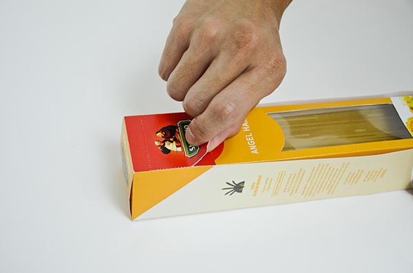
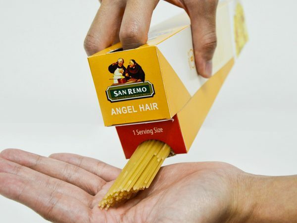
10. Design San Remo spaghetti packaging with a measuring mechanism that allows you to get an optimal portion of pasta.
Read also🧐
- Can't Unsee - a visual trainer for designers
- Are you sure a marketer? 15 examples of wild Russian advertising
- “It looked better on paper”: 15 examples of not very successful design


