Terribly bad and ill-conceived design in 20 photos
News / / January 02, 2021
How not to do advertisements, signs, home repairs and more.
A good designer can even turn a trivial thing into a work of art. A bad one - on the contrary, will ruin everything, and even create problems. Here are 20 striking examples of designs that are sure to blush for someone.
1. When the hands were out of place.

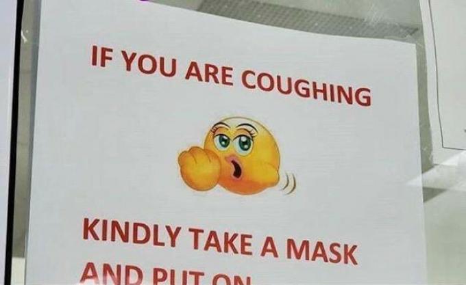
2. According to the school health center, this emoji means cough.
3. Drawing in one of the gyms.

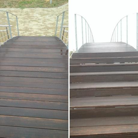
4. Bridge with a surprise.
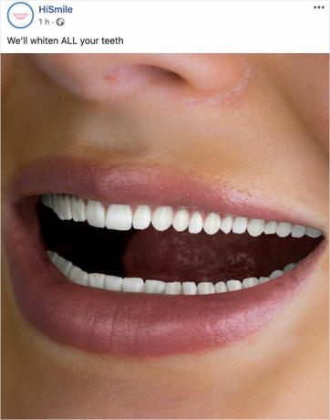
5. Advertising teeth whitening. Not for the faint of heart.
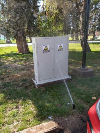
6. The best place to place the spray gun.
7. This is how they look pasta in the shape of a smiling face.
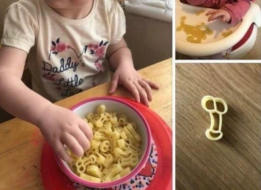
8. Children's psyche is under threat.

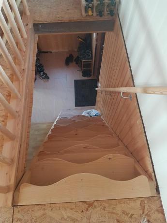
9. New candidate for a selection of stairsthat spare no one.

10. And another crazy option. Climb only a step?
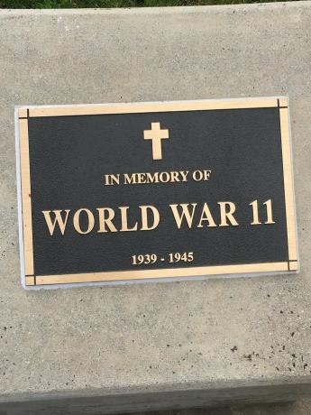
11. When Roman numerals suddenly turn to Arabic.
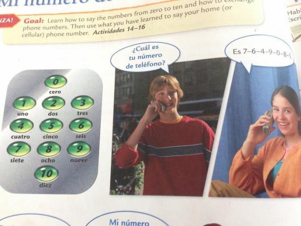
12. The fact that he calls her to find out her phone number is nothing. But the "10" button on the dialer is strong.
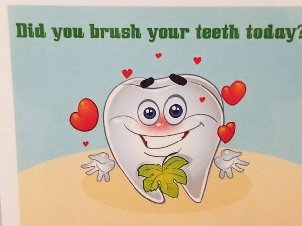
13. Is it implied that the leaf is hiding something in the tooth in love?
14. Harsh and merciless catering.
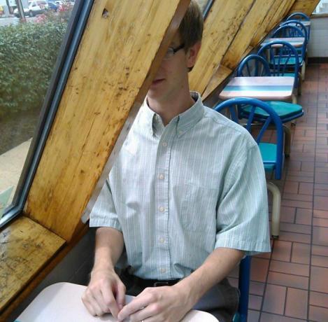
15. A picture that finally makes it clear that XXXL is just a stretched XXL.

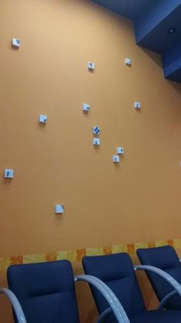
16. Brilliant wall clock. You can immediately see what time it is.
17. A tablecloth with a pattern that resembles a bunch of hair. Just what you need for a dining table.

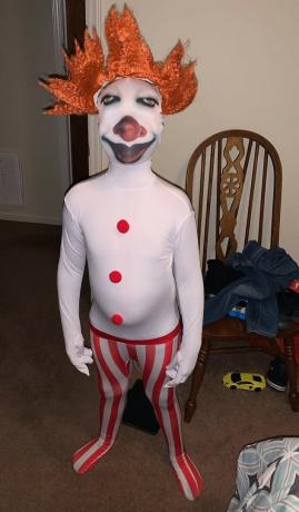
18. Pennywise's budget suit on Halloween. Very budget friendly.
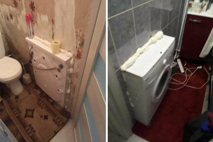
19. If Washer does not fit in either bathroomnor in restroom, place it between them.
20. Advertising as a threat: “Want to know what happens when you die? Come and find out».

Read also🧐
- 12 examples of awful design that will definitely get someone fired
- Terrible dream of a realtor: 25 examples of terrible interior solutions
- “It looked better on paper”: 15 examples of not very successful design
- Hellish kitchens: 20 examples of terrible design and ill-considered decisions

