16 examples of bad product and ad design
Internet / / December 29, 2020
Not everything from this list lends itself to logic, and some decisions even look like someone's cruel joke.
Coming up with a stylish advertising illustration or making a toy with a nice design is a simple task for professionals. Saving on such things usually does not lead to anything good. The same can be said about overly bold decisions with dubious creativity. Here are 16 striking examples of such creativity in the photos of Reddit users.
1. Not the best ad for restaurant.

2. Yes, that's right: we use a hammer for the screws.

3. The yellow bottom for an inflatable pool looks like someone's joke. It is hard to believe that water is clean, and that it is water at all.

4. Strange choice of pattern for a toilet paper roll.

5. The picture on the toilet seat box ...

6. It doesn't seem like it should work.

7. I would not want to see such a Shrek at night.

8. A clean plate with a "creative" design.

9. The pain of DC Comics fans looks like this.

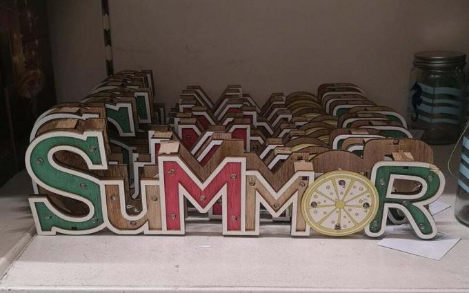
10. Summor. Why not.
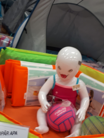
11. A dummy for baby clothes that will break someone's psyche.
12. The marks on the opaque bottle are very handy.

13. Submarine captains are very tough people.

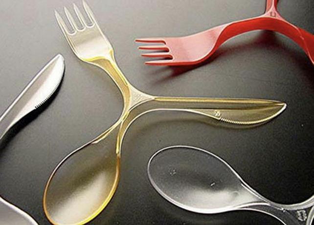
14. This thing doesn't look comfortable at all. More like spinner.
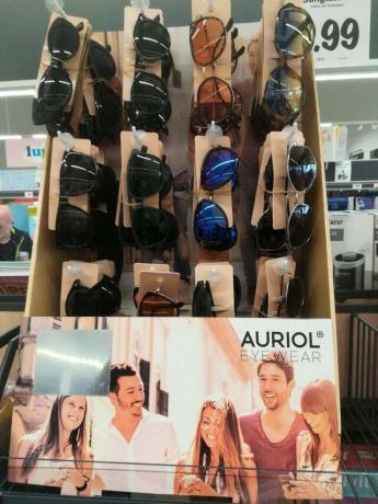
15. No one in this advertising image for the sunglasses brand is wearing glasses.
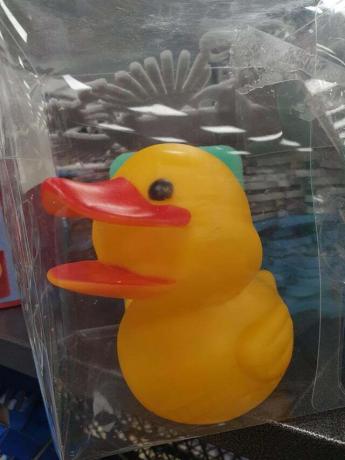
16. There is clearly something wrong with this duck.
Read also🧐
- 10 photos of strange and ill-conceived design
- 10 horrible signs and illustrations that raise questions
- 12 photos of bad advertising and packaging designs
- 20 examples of extremely unfortunate and strange designs


