Rules of good design: how to correctly use the images and videos with photostocks
Inspiration / / December 26, 2019
Content Division Depositphotos It receives from the authors about 300,000 files per week. Nearly 1.1 million images are selected and appear in the image bank in a month. But what makes the photo, drawing or video product design? Compliance with regulations 10.
These recommendations may serve you well if you are engaged in web design, develop the visual style of the brand or your position involves interaction with marketing departments and PR.
1. Do not create a design, create a message
Do not let yourself be distracted by the external aesthetics of an object or image. If you have not read the story, or the user has doubts on what the designer wanted to say, it's not design. Colors, shapes, fonts must reinforce each other and create a single message.

2. The form - this is your language
The first rule brings us to the second: pack your idea into a desired shape. Less experiments with details, effects. As the English say, «A little goes a long way». The purity of the form tells us that you probably know what you want it to say.
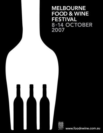
3. Examine your design minimalism
One of the main skills of the designer - to cut off the excess. We advise to look at every detail of your composition in terms of how it supports the rest of the work. Doubt something? Remove this element. Remember that we check all forms of visual expression: color, typography, graphics and geometry.
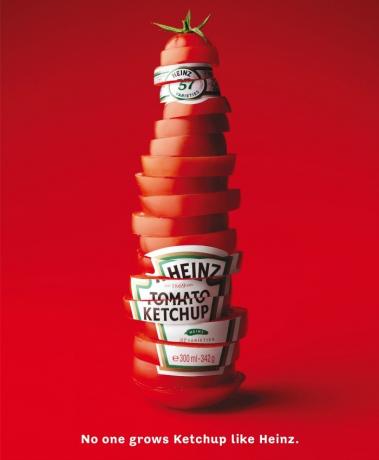
4. Use the pyramid principle
It is known that the human eye moves from the biggest, brightest and most complex forms to simpler and unsaturated color elements. Act as a voice for your audience - set the desired sequence of movement along your visual stories.
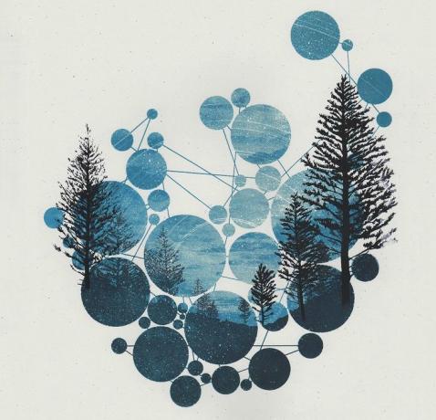
5. Color is the glue
Returning to the assertion that the main thing in the design - a message, think about the meaning of colors in different cultures, in different circumstances and in different combinations. Color is responsible for the perception of consumers of different parts of the composition and for what semantic nuances he gives them.

6. Halftone set the tone
The image must be properly balanced in the dark, medium and light tones. Do not forget to contrast different in saturation, and color temperature elements. Pay more attention to the semitones that lead attention from one color to another spot.

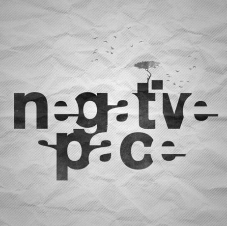
7. Font - is primarily a form of
If you are a good designer, the fonts in your design balance and composition are a counterweight to other objects. Pay attention to the space: can I use it? Specified. It is not necessary to fill the empty space without the need, but it is necessary to think about whether you can transform the space around the text in the countermold.
8. Design should sound!
Thinking composition and its elements, test the purity of sound sketch of your idea. Limited to the minimum details and ask yourself if the message is read. If yes, then you can try to play with the accents and optical anchors.

9. Treat trends with respect, but do not depend on them
Use pictures, illustrations or video photostocks, but fill their own content. Rely on ready-made solutions as the foundation to create on their basis of their posts. Repelled by the style adopted in your segment of the market, but do not forget to experiment with new ways of delivery of visual history.

10. be painter storyteller
Whether you plan to make money with Depositphotos or create a design of the first music CD for your friends. The main thing - to tell the audience the story. And how to do it, you know.
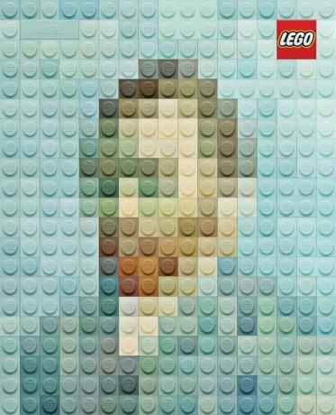
A photo: pinterest.com


