How to make a chart of the work on the project in Excel in 10 steps
Work And Study / / December 25, 2019
If you manage projects, it is important to always know how much you have problems and the time within which they must perform. And if you make a visual diagram, it will be easier to explain the key points of the life of the project team, participating in the work, as well as other interested parties.
Project management are often used special programs, but also in the usual MS Excel you can create a clear and accessible schedule.
The diagram on projects shows how events and tasks related to each other in time. Well-written chart shows important information about the performance of specific tasks and on the development of the project as a whole, helps to see the big picture.
To create a chart in MS Excel (version 2007 and later), you need to do all 10 steps.
What is that on this chart? Key details are shown with colored lines and bars:
- Line of the day - red vertical line that shows where you are today;
- timing problems - gray horizontal bars that show how long it takes each task;
- readiness tasks - green horizontal lines that indicate at what stage is the task and how much more remains to be done.
Different versions of MS Excel actions may differ slightly, but either way the process is universal, and cope with scheduling can be any user.
Detailed video (in English) can be found hereIt takes half an hour of your time.
Step 1. Starting, think about the result
To easily cope with the task, print or draw on paper schedule, what it should look like in the end. Keep a piece of paper in front of you to compare every step of the sample. Scheme do not need to carefully draw in, simply lock the diagram form and keep on hand, it will be a good reminder.
Step 2. Create a spreadsheet with the data
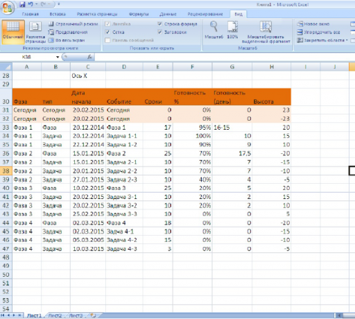
To plot a graph, you must first issue the table. In the example project is divided into four phases, each of which is a problem.
Form a table below the chart. On the 30-th row of column headers are located.
We will understand the meaning of the data in the table:
- Phase"Phase 1", "Phase 2", "3 PHASE", "Phase 4" and "Today." Shows what stage of the project corresponds to the event.
- Type of"Phase", "task", "Today." Shows the type of event, distinguishing between the task and the project execution phase.
- The date of the beginning: the date of the start of the event.
- Event: It shows the name of the event in the chart.
- dates: shows how many days takes the task.
- Willingness Percentage: demonstrates the degree of fulfillment for each task and phase, 0% - the task is not started, 100% - completed. The rate for the category "Phase" is not connected with the tasks completed and exhibited estimated. To decide on the percentage completed one or the other phase, it is necessary to apply their own rules.
- Readiness in days: period for which the index has been made ready in the event a percentage. At task which takes 10 days to complete and is of 50%, this figure will be equal to five days (10 days × 50%).
- Height: height value is important for the design, because it determines how high or low the event will be reflected in the schedule map. The values can specify any, but better to take a small number close to zero. In the example used range from +25 to -25. If the height is positive, the event reflected in the chart above the horizontal axis, if negative - below the axis.
Step 3. Create a chart with X and Y axes, add it to the first data from the column "Date"
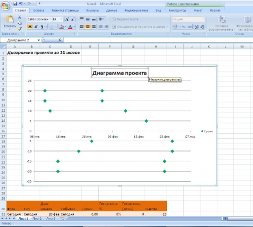
It's time to create a chart to visualize the data in the table developments made in the previous step. Use a scatter chart with the axes X and Y, are because it allows you to freely dispose of the base coordinates on both axles.
Follow these steps:
- Select the tab in the main menu "Insert".
- Next, select the "Charts» → «Spot» → «Scatter with markers" empty chart will appear in front of you.
- Hook the edge of the chart and change its size and position so that charts the field range from cell B4 to cell K26 (press and hold the Alt key to align the chart area right on the borders cells).
- Right-click on the chart and select the menu item "Select data".
Add a set of data in a range by clicking on the "Add" button in the dialog box.
- To change the name "The name of a number of" put in the appropriate field to E30 cell "Terms".
- For the value of the X-axis, select the appropriate field and select cells C33: C46 «Start date."
- For the value of the Y-axis, select the appropriate field and select cells H33: H46 «height».
- Click OK to close the Add Data window.
- Click OK to close the Data Selection window.
These actions will give us a simple dot diagram with automatic formatting.
Make the event markers are green:
- Right-click on any selected data marker, select Change "Format Data Series".
- In the list on the left, select the tab "Marker settings", then select the type of marker built "Crystal". Increase the size of 10 pt.
- In the "Fill marker" to select a solid fill. Change the fill color to green.
Now we have a scatter plot showing the time. While green markers show only start tasks.
Change the name of the chart, double-click the text box with the name and enter your name.
We still go back to the parameters of the terms in the fifth step, add horizontal bars along the axis X, and will continue until the formatting of the chart.
Step 4. We are putting in order of appearance of the chart and add the name of the event
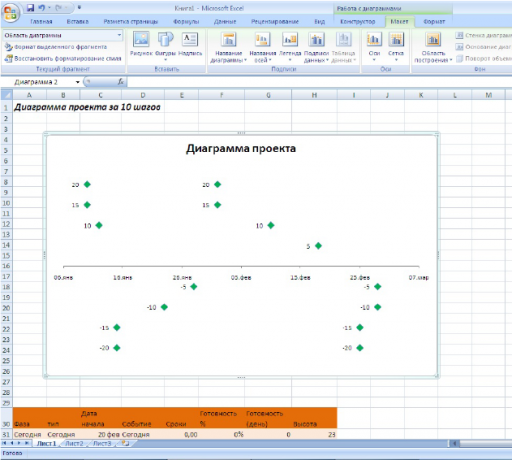
Getting rid of the fact that we do not need the chart.
Y-axis. Hide the vertical axis, because it does not carry data traffic. Select the chart, in the main menu on the tab "Working with diagrams", select "Layout". Then select the "Axis» → «basic vertical axis» → «Do not show."
horizontal guide. They, too, are useless. Select the chart, in the main menu, go to "Layout" and then select "Grid» → «horizontal grid lines on the main axis» → «Do not show."
legend chart. We then replace it with a more beautiful, and while disable "Layout» → «Legend» → «No».
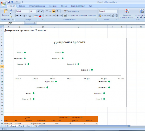
Finally display the data labels for each marker. In the main menu on the tab "Layout" select "Data Labels» → «left».
How to change data in the signature markers
Enter data about each event in the diagram long and hard, because you need to select each marker separately and rename it.
But this process can be speeded up four times:
- Click on the signature of the first marker (upper left corner of the chart), to select all the values directly. Do not press the green handle, so you select other objects!
- Click again on the signature marker to edit a single name.
- In the input field type of formula the symbol =.
- Click on cell D33, it recorded event "Phase 1", then press Enter.
- Repeat the first four steps for the remaining signatures for each marker.
How to fix the field
It will be useful to consolidate the area on a line 28 to a chart, you can always be seen in a document. The first 27 rows remain before my eyes, even if you scroll through the rest of the line.
To secure the area:
- Select the cell A28.
- Select the tab "View" in the main menu.
- Select "Window» → «Freeze Panes."
- In the drop-down menu, select "Lock field".
On the 28th line will appear black horizontal line. All that is above is now fixed, and when scrolling will move just the bottom line.
Step 5. Add error bars to display the timing to turn the chart into a visual schedule
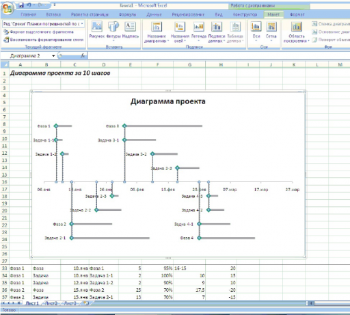
Horizontal error bars in the chart show how much time it takes to work on each task. To make them:
- Highlight schedule.
- In the main menu, "Working with Charts" tab, select "Layout".
- In the drop-down menu in the top left corner (the plot area), select the data series "Terms".
- In the "Layout" select "Error bars» → «Advanced settings error bars". A dialog box opens.
- In the drop-down menu in the upper left corner, select the chart element format "error bars along the X axis."
- As for changing the horizontal bars dialog box, select the checkbox on the value of the output "Plus". "End-style» → «No point."
- In the "margin of error", select "Custom" and press the "Enter a value." In the new window "Setting up the error bars" indicate "positive value of error" for that in the appropriate field, move the cursor and highlight the range of cells from E33 to E74. Click OK.
Now gray lines extend to the right of the green markers, they show how much time should be spent on a particular task. They need to be formatted for clarity:
- In the "Format error bars" go to the tab "Color Lines". Select "solid line". Make fill gray.
- In the "Line Type" increase the line width of up to 4 pt.
To better navigate in the diagram, it is necessary to hold the thin vertical line down from the markers. For this drop-down list in the upper left corner, select "Error bars on the Y axis." The dialog box displays the vertical error bars. Select the direction of "minus", "End style» → «No point", "The magnitude of the error» → «relative value», enter in this field to 100%. Choose the color and thickness of the lines themselves.
Step 6. Add value to the availability chart
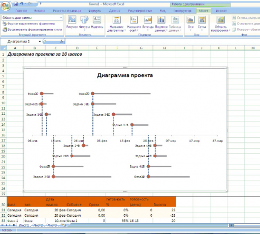
It's time to add to the chart data series, which shows the percentage done this or that task.
If the task takes 10 days and made up to 50%, the bar showing the completeness be filled halfway. It is a measure to track work, which does not take into account weekends and holidays. To add new information to the chart, follow the instructions below.
- Right-click on the chart area, from the shortcut menu, select "Select data".
- Click the "Add" button in the window that appears, define "series name", select the cell G30. range for data X and Y axes to select the same as in step 3 №.
- The chart will appear red marks, which will be hidden under a green.
Step 7. Format the results of new data
To chart shows in the same style, but the data is not superimposed on each other, format markers:
- In the drop-down menu in the upper left corner, select "number of Readiness." Immediately below the drop-down list is a button "Format the selection." Click it to open the dialog box.
- Change the parameter marker. Select the type of form "Crystal", set the size of 10 nm, a marker fill select a solid green color. Close the dialog box.
- Without removing the selection markers, click the main menu on the tab "Layout" button "Data Labels", select the pop-up menu "Do not show".
Step 8. Add error bars to keep track of the percentage of completion of tasks
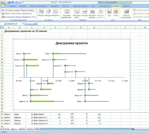
Now you need to add new strips to see at a glance what stage is the implementation of tasks.
- Again, select "number of Readiness" in the drop-down list on the left. Press the button in the main menu "error bars". Select the drop-down menu, select "More Options." A dialog box opens. Install vertical planks fixed value by writing to the appropriate zero field.
- Switch on the parameters of slats disposed parallel to axis X. Set the direction of the "Plus". "End-style» → «No point", "The magnitude of the error» → «User». In the "positive value error" dialog box, select the range of cells G33-G47.
- Change the line color to green by selecting a solid fill. Set the width of the line 7 pt.
The horizontal green lines show how to perform a task: partially or completely.
Step 9. Add a vertical line indicating the current day
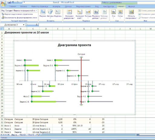
The red line shows what day it is, and makes it clear how the project fits into the overall timeframe.
- Right-click to open the context menu for the chart. Select "Choose Data".
- Click the "Add" button, enter in the field "Name of a number of" word "today." For values of X-axis enter the range of cells C31-C32, for the value of Y axis - H31-H32.
There are two new marker on the chart. Designate them: select the data and write the signature in the formula bar, the word "today". Click on the sign, right click and select the context menu item "Data Format". Put the label's position "from above".
- Go to the main menu on the tab "Layout".
- Select the drop-down list to the left in the top right corner of the item "number today."
- Add error bars with additional parameters, following the instructions in the fifth step. You will need to strap on the vertical axis, with the direction "Minus", the ultimate style "without point", the relative value of 100%.
Do you have a vertical line indicating the current day. Change the line color to red, increase the size to 3 pt.
In a sample of the current date is fixed, so that it will not change. But for projects that are developed actively, we recommend another method of accounting data. To do so, the cell B2 date by introducing the formula = TODAY () and indicate the data selection dialog box for the X axis values instead of the band B2 cell which you specified earlier.
Step 10. Add text boxes
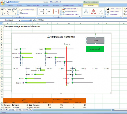
Now the chart is not enough only explanation to the symbols so that it is clear to the whole team.
- Select the chart, go to the main menu on the tab "Insert". Select "Caption".
- Place the label area in the upper right corner of the chart. Highlight border inscriptions, right-click on the shortcut menu, select "Format figure." In the window that opens, select the fill type "solid", color gray. Format label. You can insert any number of blocks.
Now you can make a chart for 20-30 minutes, using only beloved MS Excel editor.


